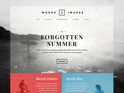
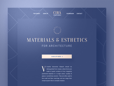
Sometimes creating a quality site can seem like a consumate minefield. Here we will give a few of the pitfalls to avoid when redesigning a site.
A fundamental mistake in web design is copying the design formats of known big brands. Remember that users of these big sites will ilkely have used these may times before, and as such be extremely familiar with what could in actuality be an extremely unothodox design. They may well become disorientated if you try to imitate them.
Another key mistake is a lack of logical connections between key aspects of the site. If your business guarantees a lightening speed service, there should be a section clearly accessible that explains this in further detail. It can be a frustrating experience for users to have to scour a site for information that should be presented initially.
Also, sometimes a site creators familiarity with their own service can cause them to inadvertently neglect to explain what the business actually is. Describe the product in depth and tell people what they want to hear. We avoid this at PageSpruce by utilizing feedback from what the business had done directly into the initial site content.

Key Areas
See the points to the right to see short descriptions of some of the most common web design mistakes.
1 Know Your Users
The depth and context of the information of the site should alway try to match the intentions of the targeted audience. For instance in matters where the may be a deep social consequence to the outcome of using a service. For example, Family Attorney. Then they will be looking for as much trusted knowledge as possible not only to educate them on the issue but also to reassure that you know what you are doing.
2 Superflous Page Effects
We absolutely believe that page effects and animations can suppliment the content of your theme immensely, they can also contribute to a greatly increased overall. user experience. According to our experience though there is such a thing as going to far. If things are added just for the sake of it or because they look cool, the effect could be negative, or even worse detrimental to their experience if something breaks or doesn't work as it is supposed to. Remember you are trying to convey a message to whoever is using the site if that message if obscured by superfluous feature then the ultimate aim of the theme has been comprimised. Our best advice is to start out simple, or focus on the effects that are already provided in the theme you are using. Add thing one at a time. Once you had added something take a break, look at some other sites and then go back to yours . If it looks out of place or unnecessary then it may be a good idea to scrap that feature and try something else.
3 Content Placement
A common mistake is to focus to much of placing information squarely with the fold. This can be a huge mistake if the site relies on the user to scroll furhter down the page to access the bulk of a pages information. A good design will position content in a way that entices user to scroll down the page.
4 Outdated content
Whilst blogs, columns and articles can be useful tools in terms of retaining visitors and boosting SEO. Neglecting to update them on a regular basis can have the opposite effect. Especially is the actual date of posting is display. A users seeing a blog that hasn't been updated in 2 years is more likely to be dissuaded from exploring the site then carrying on.
5 Lack of a Call to Action
There should a clear route between user visiting a page and actually taking action. Contact information should be logically presented as should any relevant forms. Call to actions should always be direct and unambiguous.
Contact Us
If you have any questions about PageSpruce or need a quote. Enter your details in the form below and we'll get right back to you.